My role:
- Heuristic evaluation
- Stakeholder surveys
- Stakeholder interviews
- Usabilty testing
- User journey mapping
- Wireframing
- UX writing
- UI design
The team:
- Me (UX and Content)
- Abe (Front End Development)
- Jess (Producer)
The brief
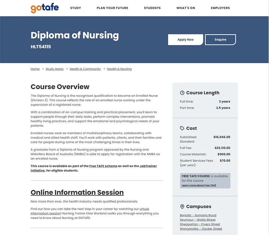
After having replatformed their public-facing website in 2019, GOTAFE wanted to turn their attention to optimising and redesigning their core journeys and high-impact pages.
Course page templates, which are essentially GOTAFE's "product" pages, were seen as the most important place to start, and were already seen as drab and unexciting by the business internally. So I was called in to explore the problems and opportunities that were present, and to give these important pages a UX and visual overhaul to help prospective students locate and understand the information relevant to the courses they're interested in.
The plan
GOTAFE's audience is made up of a hugely diverse range of people with significantly different backgrounds, needs and motivations. Their course offering is also incredibly broad, covering everything from short courses to accredited courses in a range of disciplines. Add to this a very large and interested stakeholder group and you begin to get a sense of the scope around this problem.
Because of these factors and more, we knew that a project that did not include significant engagement with GOTAFE and the communities they serve would result in poorer outcomes for both. While the scope of this project was somewhat constrained, we still wanted to ensure we spent adequate time upfront exploring this complex environment more closely. To do this, we planned a lean, three-stage approach:
1.0
Discover
User and business needs, problems to be solved
2.0
Define
Appropriate solutions for the ideal user experience
3.0
Deliver
Course pages optimised for user and business success
Discover
During the discovery phase, we sought to gather a vast range of data, feedback and information from as wide a variety of sources as possible. This would later help us triangulate the most pressing issues to be solved, validated by multiple sources of data.
Heuristic evaluation
By taking the time upfront to conduct a heuristic evaluation of the original course information journey, I was able to formulate early hypotheses, generating a large range of questions to answer in following activities, in addition to identifying the most glaring usability issues throughout the user journey.
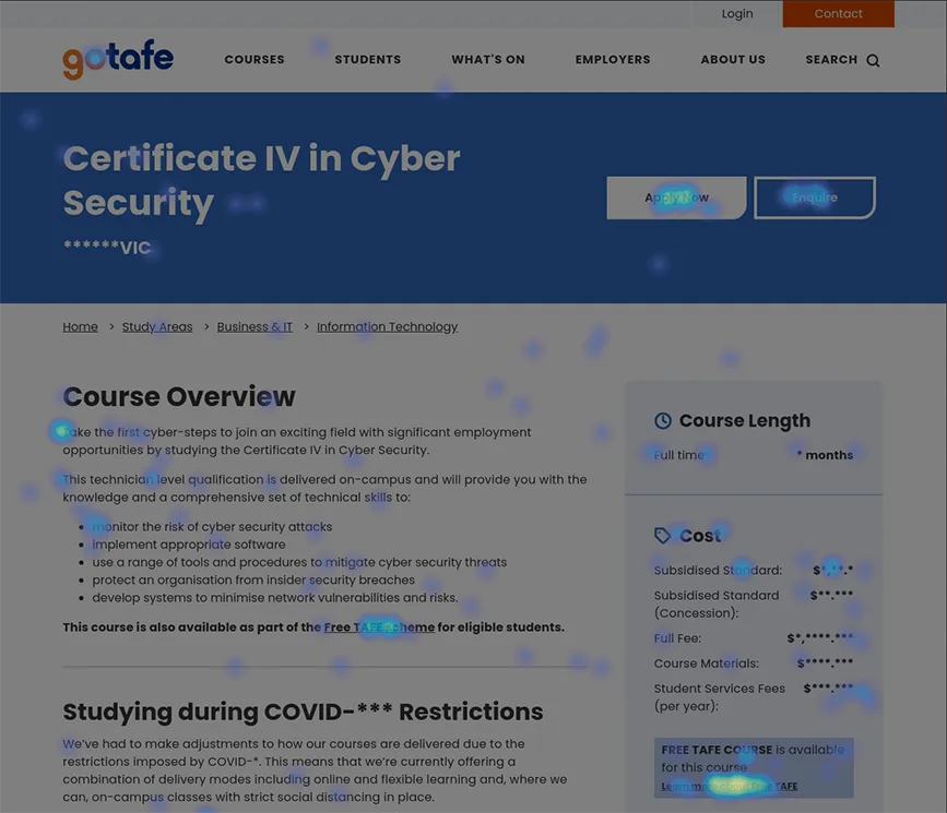
Analytics & heatmap analysis
Following the evaluation, I turned my attention towards the hard data. Looking closely at the course information journey through analytics further supported a number of theories raised in the heuristic evaluation while adding additional insight and focus areas for later activities.
Heatmap analysis across a number of popular GOTAFE course pages helped us to begin honing in further on some of our hypotheses and assumptions, while also pointing us in the direction of issues that were as yet unnoticed.
Stakeholder surveys
After gathering this large collection of hard data and knowledge from these more solitary activities, it was time to begin engaging the organisation and the communities they serve.
Due to the sheer size of the wider stakeholder group (in the hundreds), the somewhat limited scope of this project, and the nature of our questions, we found a survey to be the most effective way to gather both the many quantitative and (fewer) qualitative insights we were seeking from such a large group.
Stakeholder interviews
For those members of the internal GOTAFE community for whom these pages had the greatest impact, or for those who held responsibility for their accuracy, maintenance and efficacy, we conducted in-depth stakeholder interviews to explore requirements, uncover pain points and discuss technical considerations and constraints.
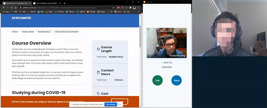
Usability testing
I also conducted remote moderated usability testing of the current website experience with prospective GOTAFE students to observe and gather first-hand evidence of the roadblocks and pain-points they experienced when attempting to explore course information.
Current state user journey mapping
To conclude our Discovery stage, I reflected the insights we'd gathered across all of our activities in a User Journey Map. This documented the overall experience target users went through (including both pains and gains) as they sought out course related information on the GOTAFE website.
This artefact became a powerful and accessible way for GOTAFE to communicate the importance of the work we were embarking on to a far wider internal audience than dusty written reports or summaries could have ever done.
Insights from Discovery
At the conclusion of our Discovery phase, we'd unearthed a number of compelling and impactful insights ranging from granular ui issues to high-level user expectations and motivations.
Some of these insights are listed below:
- Prospective students weren't necessarily interested in the finer detail of a course itself — rather, they were driven far more by the course's career outcomes and resulting lifestyle impacts.
- Utilitarian features that were of great assistance to users (save, print, etc) had very poor findability within the template UI, and were going mostly unnoticed.
- An overabundance of accordions, large slabs of text, and nondescript page headings drained users of mental energy.
- A distinct lack of visual media sucked the life out of the course page template, leaving users with little emotional connection to, or understanding of, what their life might look like as a GOTAFE student.
- While online application was a feature people expected to see and appreciated, all participants explicitly stated that their expectation was that someone would help them through it in person on-campus. The website made no mention of how GOTAFE could assist in person, leaving users uncertain and trepidatious.
- Site search was underperforming due to not supporting natural language queries, misspellings, etc.
Prospective students weren't necessarily interested in the finer detail of a course itself — rather, they were driven far more by the course's career outcomes and resulting lifestyle impacts.
Define
The purpose of our second stage was simple. Take the insights from Discovery and translate those into design solutions that overcame the greatest range of problems we had identified.
Wireframing
I explored a range of UI patterns and treatments at pace through low fidelity wireframing, conducting virtual corridor testing with anyone who would let me. I always find that involving as diverse a cast of people in the validation of design treatments to be the most effective way of highlighting gaps (or completely new issues) in my proposed solutions.
UX writing
Of course, being a course page template absolutely loaded with complex and important information meant that visual design was always only going to make up half of the equation. So before turning my attention to UI design, I reviewed the template's copy, content hierarchy, and UX microcopy to ensure it met user needs, was using their language, was specific and relevant, and spoke to the things people cared most about.
This resulted in a vastly different content structure, containing considerably more effective copy, than the original version.
UI design
Following this rapidly iterative process of wireframing and validating early prototypes, and rebuilding the template's content structure, I felt confident we'd landed on a solution that solved our problems. So I turned my attention to applying the final design layer to my work in Figma. Using their existing web style guide, I was able to create a completely refreshed course page template that still managed to sit among the rest of the site cohesively.
The result
By taking the time to learn about the business and its audience, we were able to flip the design of this page completely on its head to satisfy user needs in ways that preempted and exceeded their expectations. By removing the hurdles and roadblocks they experienced in the past, replacing them with smoother more intuitive interactions and experiences, and by aligning messaging and content formats to the audiences deeper motivations, we’ve set prospective GOTAFE students on a more confident path toward their future lives.
Additionally, by exploring the depths of GOTAFE's users' motivations, we'd uncovered a glaring hole in how courses were being communicated. Their lack of connection to career and lifestyle outcomes meant that prospective students weren't able to get a feeling of the impact a course could have on their lives in the long run, making it hard to take the significant first step of applying. By catering to this unmet need through the addition of engaging and thorough job and industry outlook statistics, we were able to connect education to outcome for GOTAFE's users.
What did I learn?
This project mostly reinforced something i already knew to be true (but always a valuable lesson nonetheless) — that no matter the scope of a project, if you have the space and time to truly engage the people around a problem and consider their experiences thoughtfully, you will always find a solution.
Additionally, this project absolutely reinforced the old notion that "people don't want a quarter-inch drill-bit (a course), they want a quarter-inch hole (a lifestyle)".
On a far more practical and hands-on level, I used this project as an opportunity to grasp the finer points of Figma's 'auto layout' feature, which has resulted in the creation of a user journey map template my team can utilise on other projects. This has drastically reduced the time and effort required to produce a high-quality deliverable that our clients really love to see, giving our whole team more time to focus on unearthing more problems and exploring more solutions.
What I'd change
If I could change anything, I'd have conducted a greater amount of testing at the wireframing stage with actual users to ensure the most appropriate and effective ideas were selected. While I'm very confident in the corridor testing and the direction it took us, I am not the user and neither were most of the corridor test participants.